Category: Uncategorised

Module 5: Advanced Multimedia Tools

This week we explored Generative Artificial Intelligence (AI) and Data Visualization, two things I find very interesting! I feel that many professors assume AI in any form is inherently “bad” and should not be used to any extent, so I was eager to learn about AI in an educational way. Due to this narrative I had about AI, I haven’t explored it too much so I found it very fun to explore some of the capabilities of AI this week. After this week of exploration using AI, I definitely think professors should not have such a cut and dry opinion about the use of AI in courses, because I think when used correctly, and for honorable reasons it can be very helpful. In this blog post I will answer some reflection questions as well as some screenshots of some of the AI exploration I did.

Have you used AI applications before? If you have, what have you used them for?

I have used AI applications before, but not a lot. Like I mentioned, many of my professors use a scare tactic about AI- saying things like if you use it they will give you a zero, or whatever it may be.  However, this past year I have found myself using AI for an idea generation platform. For example, in this course we needed to create a video tutorial, I was struggling to think of an idea of what I could film myself doing. I went on to ChatGPT and typed in something along the lines of “Create a topic for a video tutorial I would show to elementary aged students” – many ideas came up, most of them I do not remember but the one I went with was “How to Make a Peanut Butter and Jelly Sandwich”. While this is a simple idea, I did not come up with it myself. However, I still created the script, storyboard, and filmed the video on my own- without the use of AI. I also used ChatGPT for an elementary math course that I am in. We do weekly lesson plans about the math topic we learned that week, one of the components of it is to create a hands on activity. Sometimes, when I am stumped, I will put the topic into ChatGPT and ask what a hands on activity is for a specific age range- I will often take the idea and alter it so it fits the content we learned that week. Overall, I think there are very productive and helpful ways to use AI. I have, however, only explored ChatGPT for questions such as these, I had not explored any other apps prior to this Module. 

What guidelines do you think should be in place to guide their use in an educational institution? What factors should be considered?

I completely understand the hesitation about using generative AI in educational institutions as it is a powerful tool that can be easily abused. As I mentioned above, I have used AI in school work to generate ideas. I think this use is appropriate in an educational institution, because I am not asking the platform to create any content, just the idea. Meaning, I am using my brain to create the assignment, sometimes we just need a push to start!

I think using AI to complete your work is an inappropriate way to use the platform. To start, it is basic plagiarism which has never been allowed in an educational institution. As mentioned in this module, submitting anything not written by oneself is plagiarism, and I agree that generative AI falls into that category. Secondly, as stated by the OpenAI website, ChatGPT does not always give accurate information- even if it sounds convincing. I strongly believe if professors were to educate students about both the cons and pros of AI, we could be using the tool much more effectively. As I keep reiterating, AI can be used for really great things, when used correctly. 

What tools did you find useful in your explorations this week and how did you use them? Which ones were not useful? + examples!

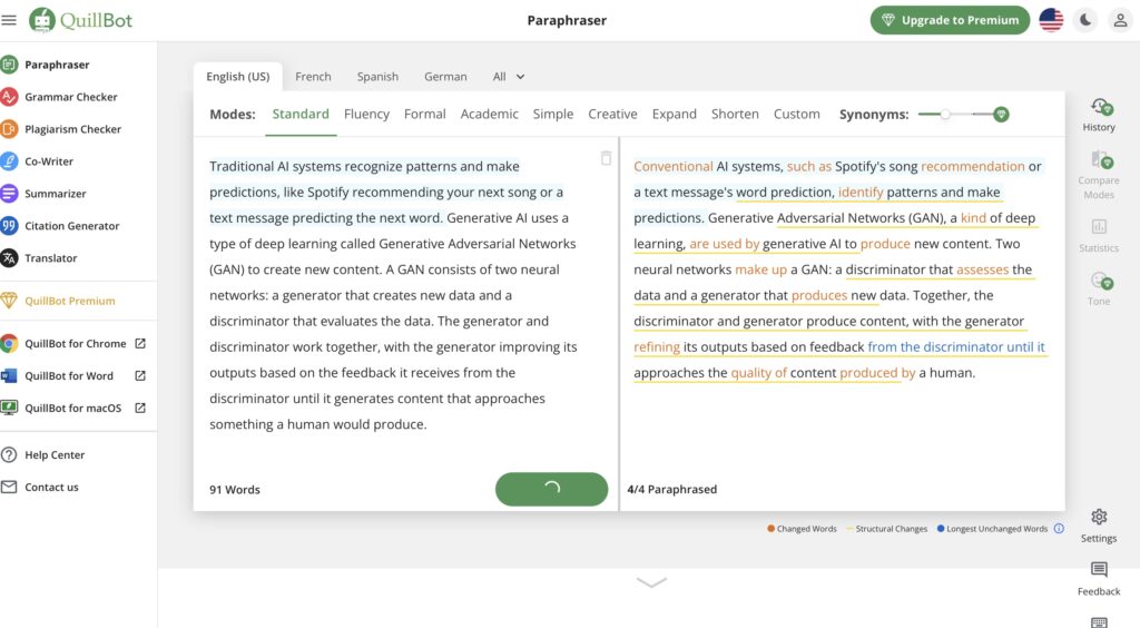
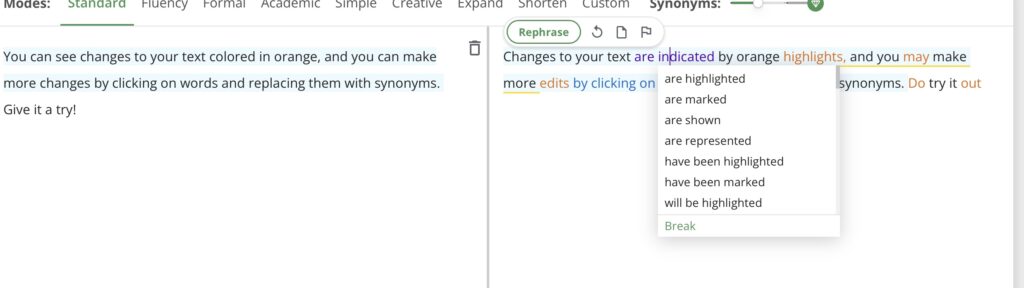
The first tool I started exploring was QuillBot (QuillBot, 2023)- an online paraphrasing tool. I first tried it out with a few of the premade examples and noticed it seems to take out key words and re-word them. I decided to put in a paragraph from this week’s module and try to paraphrase it. The original paragraph was 91 words and the paraphrased version was 84. So, not a huge difference. It did consolidate some sentences, but overall I do not think it was super useful. However, one feature I did like was that it showed you possible synonyms to use. This is something I could see myself using because I often find myself using the same  words- and synonyms always make things a little more interesting. 

QuillBot. (2023, November 21). [QuillBot paraphrases prompt about traditional AI systems]. https://quillbot.com
QuillBot. (2023, November 21). [QuillBot paraphrases prompt about changing text colors and synonyms]. https://quillbot.com

I am pretty familiar with using AI for text reasons. I wanted to explore some of the photo AI generators as well- because I am completely unfamiliar with it. I tried using Dall-E2 but was not able to since I needed to purchase credits, however I looked at some of the examples that were posted and I was impressed. I also tried Stable Diffusion Online, a free platform to generate photos. I was asked to write a prompt of what photo I wanted generated. I started with “a sunflower in a green vase” and within a minute that photo had been generated. I was honestly very impressed, but realized it was a very simple photo to generate so I wanted to get a bit more creative with it. Being in the Christmas spirit, and proud owner of a Kia Soul, I decided to test this platform by asking it to generate a photo of Santa Claus driving a Kia Soul. This photo took significantly longer to generate. Now, it did not generate exactly what I was looking for- but it did create a red Kia Soul in what appears to be snow- so the idea was definitely there.  Now I don’t necessarily see myself using Stable Diffusion, just because I don’t really have the need to generate photos – however, I am wildly impressed by the ability of AI to create images based on just a few words. I could have kept experimenting with this for hours! 

Stable Diffusion. (2023, November 21). [Stable Diffusion generated photo to prompt ‘Sunflower in a Green Vase’]. https://stablediffusionweb.com/#ai-image-generator
Stable Diffusion. (2023, November 21). [Stable Diffusion generated photo to prompt ‘Santa Claus Driving a Kia Soul’]. https://stablediffusionweb.com/#ai-image-generator

What examples have you seen of good data visualization?

Of the examples of data visualization given in this week’s module, I found the New York Times Covid map to be the most intuitive. The main graphic is a monthly graph of reported cases, it is very easy to understand and read. I felt with some of the other visuals we saw, it was hard to know exactly what was being displayed, this one clearly showed the months and the reported cases. An interesting thought I had in mind after reading this week’s module was: I wonder how accurate this information is? This graphic shows data collection, but how and where was the data  collected? COVID was hard to measure since not everyone was testing or reporting they were sick, so it is hard to know how accurate these numbers were. However, I would assume while this graphic may not be exactly accurate, it follows the correct trend. We talked about some important features of data visualization including keeping things simple, labeling clearly, and using color intentionally. I feel that the New York Times Covid graphic was simple, labeled clearly, and used color sparingly but effectively- I think that is why this was my favorite graphic to look at and understand. One accessibility tip I would give is that the labels were a very light grey color- which could be hard for some to see. I think it is important to make sure we use dark fonts even if it does not look as aesthetically “nice”.

Overall, I really enjoyed being able to dive into Generative AI and data visualization. I specifically enjoyed learning about the benefits and the good that can come from AI, since everything I have heard up till this point has been quite negative. I think I will use some of these new platforms, responsibly, in my future as a student and as an educator.

Module 4: Principles of Learning Design and Active Learning

This week we learned about active learning and lesson planning techniques. As a future educator, with not a lot of previous knowledge about lesson plans, I found this week’s module to be very interesting and helpful. I really enjoy learning content that is applicable to my life- something we also got to learn about this week through Merrill’s First Principles, which I found very intriguing.

In this blog post I have a link to my lesson planning sheet and my H5P interactive video, as well as a few reflection questions.

What authentic problem would you use to design a lesson using Merrill’s principles? What media or multimedia (interactive or not) would you create to support it?

I wrote this blog post on a day I took out my garbage and recycling to be picked up and I decided an authentic problem I could talk about was waste reduction. I thought this was a good topic for this question because it appeals to many of the principles that Merrill mentioned to promote learning. To start, waste reduction is a real-world problem that learners have the ability to make a change through small actions.  I personally feel more motivated to learn something if I know I can achieve it in the real world. Secondly, I feel many learners have a basic understanding of waste reduction (ie. reuse, reduce, recycle – taught to all elementary school students), so this existing knowledge will help aid future knowledge. I think if waste reduction tactics were demonstrated to learners and learners were given an opportunity to apply the knowledge, then this topic has the potential to be a very effective topic. I would like to provide a demonstration such as a video or infographic. There are many resources online that provide step by step instruction of waste reduction, such as this on, https://www.youtube.com/watch?v=4JDGFNoY-rQ. It explains in simple, yet meaningful words how we can all make a difference. I think showing a video such as this is a great way to introduce a topic before diving into it more. I liked the idea of a branched scenario situation mentioned; which incorporates simulating a real-world problem, activating prior learning, and demonstrating to allow the learner to demonstrate the knowledge. I try to apply this skill in my lesson plan, shown later in the blog. 

Where do you see constructive alignment and backward design used in this course or another course you are taking/have taken? Is there anywhere where it seems to be missing?

I feel that the design of starting with the outcome and working backward is a very common practice in curriculum. In this course, every module starts with an overview by saying something along the lines of “In this module we take a look at 
” , we go over what platforms we will use and then we begin the content. In almost every university class I have taken, we start with learning goals and outcomes. We are given a syllabus to reflect back on to see how we will be assessed, and sometimes this is touched on at the beginning of a module too. I think it is crucial to let students know what is expected of them, and let them know what they can expect to learn. It also is important to keep the educator on topic, if we don’t have a clear plan of what we want to achieve then learners will not be taught to their full potential.  I think the concept of Constructive Alignment and Backward Design is critical both for learners and educators. 

How have you found the balance of passive and active learning in this course for your learning? How does it compare to your experience in other courses?

I think EDCI 337 is a great combination of both passive and active learning. Every module starts with an overview of concepts and a few paragraphs about each topic. This would be considered the passive learning portion, as the learner I am expected to read the writing and soak it in. Then, through active learning I am able to apply what I learned into the interactive part of the lesson- the active learning portion. An example of this could be taken from last week’s module. We were assigned to read and watch videos about the power of storytelling, all we were expected to do was to read and digest the material. That is passive learning. After watching the videos and reading the articles and blog posts we were asked to create our own video using the techniques we learned, a perfect example of active learning! I think this course focuses on active learning significantly more than any other course I am in. Many of my other higher level courses are primarily passive learning, where I show up to class, listen to a professor lecture to me, and leave. While I may demonstrate my learning through an assignment such as a paper, it is not the ideal active learning- at least for myself. I think having weekly assignments to apply the knowledge learned that week is extremely important. 

What was your experience of trying out H5P? Which of the activities do you think you would make most use of in your teaching context and what would you use them to do?

While I did struggle at first to get the hang of H5P, once I understood the functions I did really enjoy the platform. One thing I had time choosing was what video of mine I wanted to make interactive. I decided to use the video from Assignment 2 and give it some interactive components. I unfortunately was not able to upload the whole 4 minute video I filmed for Assignment 2, so on this blog I will attach a 40 second clip of some of the interactions I tried. While they aren’t groundbreaking or fancy, it was fun to experiment with these functions. I think the interactive videos are a great feature when trying to make a lesson include both passive and active learning. While watching the video you are passively learning and then when a question pops on the screen and you interact with it, you switch gears to active learning. I think it is a great way to keep a video engaging for learners.

Linked here is the H5P video- again, it is only a cropped version of what I did because I was not able to upload a larger video onto WordPress.

Lesson Planning Document

Since I touched on waste reduction earlier I decided to create a lesson plan around waste reduction. This lesson is targeted to young elementary school students who may have previous knowledge of the slogan “Reduce, Reuse, Recycle” but not a lot of knowledge outside of that.

Module 3: Story Telling and Creating Video

This week we were able to explore the significance of story telling. Story telling is such an important part of human life and I was excited to dive into it over the past 2 weeks.

Describe a meaningful learning experience that started with a story that you heard. What made it impactful for you? What senses did it appeal to? Did you recognize any of the storytelling techniques reviewed this week?

My dad is a big story teller. He often makes his stories a bit too long and reiterates the same point one too many times but he does know how to keep everyone engaged and laughing. He grew up with a mom and dad who were both school teachers. He often told my siblings and I stories about what they were like as teachers. I remember one specific story he told us about how his father, a history teacher, delivered a lesson standing on top of a table. He seemed to be a very engaging and wonderful teacher. When my grandpa passed, a facebook page was created where his former students reflected on memories they had of him. Many of the stories shared matched the ones my dad would tell me. 

I’ve always thought I wanted to be a teacher, but hearing these stories from his past students really solidified in me that being a teacher is exactly what I want to do. I hope to make half of the impact my grandpa made on his students. I think the most wonderful thing about story telling is that I would have never known about the greatness of my grandpas teachings if it weren’t for these stories. The people telling these stories are complete strangers to me, yet there stories impact me greatly. The stories were heartfelt and really made you feel the sorrow these people had after hearing about the passing of my grandpa.

The main technique used in these stories was telling personal stories. Everyone who told stories was able to provide such great detail because it happened to them personally. They also all ended with a positive takeaway. While the stories were sad, due to the nature of the conversation, they all ended looking back on a great memory in a positive way.

While this isn’t about one story in specific, I felt like these stories about my grandpa encompassed the question well.

My Choose your Own Adventure Story on Twine

Below is a screenshot of my Twine story. This was my first time using Twine, and while I found it a little confusing at first it ended up being a fairly simple process. I create a very basic story with limited options but while I was prepping for this I watched a few YouTube videos about Twine and people made some very complex designs! Twine is a very fun program and I hope to learn more skills using it.

https://twinery.org/2/#/stories/e0756d04-edd1-4402-97e6-e2a2c76b5c8b – Here is a link to my interactive story.

In the reading this week, 7 Storytelling Techniques Used by the Most Inspiring TED Presenters, which of the presenters did you find most compelling? What technique(s) did you recognize in their talk?

I found the TED talk by Leslie Morgan Steiner to be quite compelling. One minute into the presentation she had a gun pulled out on stage, making me take a large breath in and wonder where her story was going to lead to. If pulling out a gun on stage isnt an attention grabber, I don’t know what is! She was able to immediately pull me in and I felt a strong curiosity to hear the rest of her story. She used many of the techniques for powerful storytelling. First, she based this TED talk off a personal story. She went into such great detail about meeting her abuser that I felt like I was living a part of the story as well. While telling this story she also created some suspense by starting with the gun out, we knew the story was going to get grim but then she went to talk about meeting a very “nice” man. She went on to tell an engaging and powerful story. Another technique I really appreciated was ending with a positive takeaway. With a story this dark and deep it is powerful to end with a positive take on the topic.  Overall this was a very moving TED talk, it was scary, eye-opening, and well delivered. I was engaged for the entirety of the 15 minutes and truly felt touched by the story. 

What storytelling techniques have you used instinctively and which ones require more work for you? Which techniques will you focus on moving forward? 

I feel like I use techniques such as telling a personal story and creating suspense most instinctively. Most, if not all, stories I tell are personal stories- they are things that have happened to me in the past. I find those stories to be easiest to tell since you were there so you remember all of the details. I also think I create suspense in my stories, often because I will start a story by saying something along the lines of “Did I tell you guys about the time I (…)”, and typically the thing I say is a bit dramatic or has potential to be suspenseful. I guess in a way I am starting at the end of my story and then going back and explaining how it got to that point. Starting in the middle or end and working backward is noted to be a technique of good story telling.

Some of the techniques are struggle with, or require more work are ones such as immersing the audience with photos and words, and building up to a S.T.A.R. moment. I feel that I am not great at immersing my audience because I often don’t use imagery. I don’t often have access to an image of the story, but I also feel like I don’t use many words that create mental images. I would like to work on this because I feel like it is very meaningful. As for the S.T.A.R. moment, I feel like my stories are normally about quite tame topics and don’t necessarily end with a large S.T.A.R. moments. However, maybe I should work on making the conclusion of my story a bit more of a “wow” moment. I will definitely work on creating imagery for my audience as I continue telling stories.

Assignment 2: Video for a Learning Purpose

For this assignment I was able to reflect on the past three modules of content to create an educational video. This was my first time creating an educational video in this format, and while it was challenging, seeing the end product was rewarding. There are many things I learned from the planning, creating, and editing process of this video and I hope to continue to grow these skills. Below there will be a link to my video, the story board, simple script, transcription, and reflection questions.

This video teaches individuals how to make a peanut butter and jelly sandwich. In order to follow along with this video, individuals need access to 2 slices of bread, peanut butter, jelly, a butter knife, and a plate.

Please find the video here.

Below is my story board. This is a rough, written version of my video with photos describing what will be shown.


Next, is my simple script. This is what I tried to follow while I was filming my video- while it is not word for word the same, it is very similar.

Simple Script: 

“Hello Everyone! My name is Alys. Welcome to this video. Today I will be teaching you how to make a Peanut Butter and Jelly sandwich.” 

Text: How to Make a Peanut Butter and Jelly Sandwhich 

“Peanut Butter and Jelly sandwiches are a quick, healthy, and filling food that are so easy to make.” 

“First, here is a list of things you will need to make a peanut butter and jelly sandwich.” 

Text:    2 slices of bread 

Jar of peanut butter 

Jar of jam (any type) 

Butter Knife 

Plate 

Visual: Pointing or Lifting each ingredient up  

“Our first step to making a peanut butter and jelly sandwich is having clean hands! We should always start the cooking process with clean hands.” 

Text: Wash hands!  

“Washing your hands ensures your food stays germ free.” 

“Our second step is gathering the ingredients.” 

Visual: Close up of Peanut Butter, Bread, and Jelly 

“You’ll need to grab 2 pieces of bread (any type will work whether it be white bread or whole wheat bread), peanut butter, and jelly and lay them on a clean cooking surface.” 

“Now it is time to assemble.” 

Text: Assembly time! 

“We are going to start by grabbing our bread of choice and placing them side by side.” 

“Next, grab your butter knife and dip it into the peanut butter. You’ll want to get a good scoop of the peanut butter and place it on one side of the bread. Spread it around!” 

Text: Spread peanut butter evenly 

“If you are planning on using the same knife for peanut butter and jelly, make sure you wipe the peanut butter off before our next step.” 

“Next, we will repeat this process but with the jelly. Grab the other side of bread, dip the clean knife in, and spread an even amount of jelly over the bread.” 

Text: Spread Jelly on other side of bread  

“Now we need to place both sides together. Grab the slice of bread with peanut butter on it and place it over top of the jelly slice.” 

Text: Combine both slices 

“This next step is optional, but I recommended cutting your sandwich up into halves or quarters for easier eating. My favorite way is cutting it diagonally.” 

Visual: Butter knife cutting through bread at a diagonal cut. 

“Your sandwich is now ready to enjoy!” 

“There you have it, your peanut butter and jelly sandwich is ready to be eaten. I hope you all enjoy your tasty treat.” 

Visual: Me taking a bite of sandwich and enjoying it. 


Reflection Questions

What was the learning purpose? 

The learning purpose of my video was to demonstrate how to make a peanut butter and jelly sandwich. I feel that a peanut butter and jelly sandwich is a very basic and simple task that children of all ages could complete, however not every child knows how to. I thought this video could provide a simple explanation as to how to make this yummy snack. 


What was challenging about capturing your own video? 

I was filming this alone and I had to put a lot of thought into where I could position my camera so that both my face and the sandwich could be in the frame. I think it would have been much easier to film if I had a tripod to hold my phone, or a friend to film me. I also found it extremely challenging to watch myself on my Iphone screen! Seeing myself talking to my phone made me overthink a lot of the things I was saying. I also felt I was trying to stay on script too much at the beginning but after a couple re-takes it felt much more natural to me. Aside from capturing the video, I had an extremely hard time adding the text into my video. I chose to use IMovie- which does not allow you to add your own text box- you have to fill in premade templates. I felt none of the templates worked very well with my framing, so that was very frustrating. I would have liked to have put my text in a shaded text box so that it was easier to read in order to make it easier to read and to improve accessibility. Now I know for next time that IMovie is not the greatest for projects such as these. 


What did you find the easiest? 

Once I felt more comfortable talking to my camera I found the actual filming part to be quite easy. I probably took well over 10 clips of my introduction before I felt okay talking to my camera, after that it was pretty smooth sailing. Prior to filming I made a script that I wanted to follow so I knew the general idea of what I wanted to say next, I think this made the filming process much easier. I also found making the storyboard to be quite easy and enjoyable, it is nice to have a solid foundation before you start the filming processes.


How would you approach capturing video differently next time? 

I would definitely get a tripod, or find a better way to position my phone. I would also try and find a microphone or an audio enhancer because I felt at times my voice didn’t come off as loud as I would want. In terms of editing, I would use a different editor than IMovie, not being able to place my own text boxes was very frustrating and I feel like it makes my video less accessible. I tried to keep in mind the contrast errors that were identified in my WAVE report- yet I felt like every color I chose had poor contrast without having a black background behind the text. It’s frustrating when you know the problem is there but can’t find a way to fix it! Hopefully a different application could alleviate this problem.


Which of the principles we’ve covered this term (e.g., Mayer/Universal Design for Learning/Cognitive Load Theory) did you incorporate into your design and why?

I tried to be very conscious of Mayers Principles and Cognitive Load Theory while creating this video. I wanted to make my video accessible and easy to understand and having these principles and theories in mind made this possible.

I tried to limit extraneous cognitive load by keeping my video design simple. I had in mind the redundancy principle by avoiding adding text to things that I was narrating, such as the details to the steps I outlined. Instead, I provided a very short explanation to what the step was and then allowed the viewer to listen and watch for the rest. I knew I didn’t want to include too much text, narration, and video so I limited the overall amount of text. Piggybacking this idea, I also kept in mind the signaling principle, I tried to add a cue (via text box) for the most important thing (ie. the step) and not write out all the details. The headings allow the viewer to know what the topic of that section of video was going to be.

I also tried to limit intrinsic cognitive load. I kept in mind the principle of modality by not just showing the peanut butter and writing ‘peanut butter’ on the screen but instead saying the word peanut butter and showing the physical peanut butter as well.

The topic of my video was very simple so I did not have a hard time keeping my explanations and vocabulary simple, however, I did try to keep in mind the personalization principle by trying to present the topic in a very conversationalist way. It can be easy to write a formal script and follow it word by word but I tried to remember that no one wants to watch a formal, monotone video of making a PB&J sandwich. I went off script when needed to make the video feel more friendly and conversational.

I wanted to keep my video simple, yet effective. I feel that keeping in mind Mayers Principles and Cognitive Load Theory allowed me to do so.


Extra Documents:

I uploaded this video on Vimeo and I was unsure how to add closed captions to the video. Because of this I wanted to create a short document, or transcription, that could serve as a replacement for the lack of closed captions. That document is below.

Comments on Classmates Blogs

Comment on Nicole Campbell’s Blog – https://nicolecampbell2.opened.ca/module-2-design-principles-for-effective-and-accessible-multimedia/

Hey Nicole! 

My Wave report was similar to yours in that it had no errors, but many counts of contrast issues. When creating my blog I didn’t think to adjust the colors because to me they looked okay, it really is eye-opening to see these things from a different perspective. 

I enjoyed the section of your blog about Text to Speech and using it for driving as a hands free option, I use this feature all the time and didn’t really process that it was a text to speech function! When I wrote my blog I noted how I used text to speech for things such as listening to audiobooks, but I didn’t think about things such as navigation- that was a really great point. I definitely use text to speech more than I thought I did. 

I enjoyed looking at your infographic – I didn’t know anything about Utrecht, so I enjoyed getting a couple quick facts about it. I like the use of simple fonts and engaging photos. It was easy to follow yet still engaging and interesting. 

This was a great blog to read Nicole, thank you for sharing your insights!

Comment on Skye’s Blog – https://skyerohani.opened.ca/2023/09/29/module-1/#comment-11

Hey Skye! 

I relate to the point you made about going a bit overboard when not given a limit of how much content to include. I often find myself rambling on and on when I could have said the point in a few short sentences. As you said, I think we use all of these principles in our life on a daily basis but being aware of them will really elevate our work. 

I really enjoyed your screencast, I bet you had an easy time this past week making the infographic on Canva! You explained things slowly and well and I felt if I would have been able to follow along. I enjoyed how you showed us with your mouse what you were doing instead of just saying it, it made it very easy to follow along. I also struggled with the redundancy principle with my screencast as I felt I was repeating some things, but I definitely think that is something that comes with practice. 

Overall, I really enjoyed this blog and think you did a great job!

Comment on Chris Ehmann’s Blog – https://chrisehmann.opened.ca/2023/09/24/module-one-screencasting-and-the-theories-of-multimedia-learning/

Hey! I really like the point you made about the tone of voice you have when trying to teach someone. Even when we do all the “right” things while teaching someone if we use a forceful tone it causes unnecessary stress to the learner, leading to that cognitive overload that we reflected on this week. 

Your screencast was very well done. I was able to understand each step you did and feel that I would have been able to follow along as a learner. Great job Chris!

Comment on Chris Ehmann’s Blog – https://chrisehmann.opened.ca/2023/11/03/module-four-learning-principles/#comment-5

Hey Chris! Great blog this week. I really like the flashcards you made using HP5, I did not know this was a feature of HP5 but I could definitely see myself using it in the future! Flashcards are always helpful, but being able to actually write the word is a great learning idea- so I can see how HP5 would be very useful! Nice work on your lesson plan as well- it looks engaging and accessible. Great work!

Comment on Charlie’s Blog – https://charlieswordpressblog.opened.ca/2023/11/19/module-5-advanced-multimedia-tools/#comment-7

Hey Charlie! You raise a great point about the future of jobs with the increase of AI. I explored one of the AI platforms that generates photos and I was shocked by the detail of the generated photos. While I don’t think (and really hope) it will replace artists, I think it will become much more common for people to have generated photos in their home- a scary thought! It is also a great point that we can generate these photos in a matter of seconds through AI whereas an artist may takes days, weeks, or even months to complete a piece of art. 

I agree with all of your points about generative AI- and the story you generated was impressive! Great work this week!

Module 2: Design Principles for Effective and Accessible Multimedia

This week we looked at different design principles focused on the inclusivity and accessibility of multimedia. I felt that I learned a lot this week about valuable information that I will bring along with me as I design inclusive lessons and media as an educator.

What did you find when you ran the WAVE accessibility report on your blog post(s)? What did you expect and what was surprising? Is there anything you will do differently going forward?

My WAVE accessibility report found no errors, but 12 contrast issues, 2 alerts, 7 features, 21 structural elements, and 10 ARIA. Many of the contrast errors were from the automatic features of the website- things I did not add myself. It is interesting to me that templates are made that have such accessibility issues, it definitely makes me more conscious of the templates I am choosing to use. I wouldn’t have thought to change these features. For features I did add, I find myself using colors such as grey because I think they are “soft” and aesthetically pleasing- this was a great reminder that the look of the website means nothing if people cannot see the components on it. I also did not include any captions for my screencast, something I will definitely include next time I do a screencast or a project with audio. I really enjoy the WAVE platform and will be saving it for future use.

What does inclusive design mean to you?

To me inclusive design means to realize that each individual learns and processes in different ways. It is not fair for us to create a “one size fits all ” design that is supposed to cater to every person’s needs. It means to add features into a design that accommodate more people. For me, it also is important to remember that looks are not everything when it comes to designing pages and sites. I often find myself prioritizing the look of the page over the functionality of it to all people. I catch myself thinking “if it works for me why wouldn’t it work for everyone”, after reflecting on the readings and videos this week about inclusive design I know I need to be much more aware of these small but meaningful details.

Have you used Text to Speech tools before? Did you find it useful? Did you try out some of the different voices? What impact did the different voices have on your ability to absorb information?

I do not have much experience with text to speech tools, I mainly use this feature if I want to read an audiobook while I am driving or doing work around my house. I think that audiobooks use a different more natural tone, because the text to speech tools that I played around with did not sound quite as natural. I tried out Natural Readers and I went through a few different voices. I found that the male voices had a more lifelike tone, but a lot of the female voices sounded quite robotic to me. I personally did not find it useful, but I also know I am not the targeted audience for these features. I think the male voices of Natural Readers would be a great choice for someone who struggles with reading. I hope they are able to make the female voices a bit less robotic as I feel that is an important feature to have. I felt with the deeper voices I was able to take in the information a bit more compared to the female voices, but to be honest I felt a bit distracted with both of them. 

Which design principles did you use to create your infographic in Canva? Which elements of a ‘good infographic’ were you able to incorporate? What other principles did you consider?

I tried to include as many of the design principles that I could in my infographic to make it accessible for the widest range of people. I am new to using Canva so I tried my best to make it neat and focus on alignment, but I found myself struggling to make things perfectly neat. I also tried to work on the contrast of my background colors and text colors. On my WAVE report of my blog post #1 I had a lot of alerts for contrast errors, so I tried to make the background dark and the text colors light. I also used repetition in my design, I tried to keep each of the five categories formatted the same and around the same length. I feel that I could have included more negative space in my infographic, it was quite colorful and did not contain much negative space.  I really enjoy using Canva and I want to improve my skills in making infographics as I feel it is a very important skill to have, especially in education.

Overall, I felt this week was very valuable and I enjoyed learning about how to make multimedia more inclusive and accessible.

Module 1: How Do We Learn?

This week we discussed Multimedia Learning Theory, specifically the theories and principles that construct Mayer’s Cognitive Theory of Multimedia learning.

Of all the principles of Cognitive Theory of Multimedia Learning we looked at in this module, which seem most intuitive to you?

The principle I find most intuitive, as someone who wants to be a teacher, is the idea of Cognitive Load Theory. Cognitive Load Theory focuses on how we process information. The part of this I found most intuitive was the idea of extraneous cognitive load. It is obvious to us that removing the “fluff” makes learning more straightforward and easy to process. Adding unnecessary information makes it harder to process the necessary information. One thing I did think was a helpful thing to reflect on, especially as a future teacher, is the redundancy principle. When I think of powerpoints we make for children I think of bright colors, noise, and animations- all of which have the goal of keeping the childs attention on the board. However, I found it very beneficial to learn about the importance of limiting these external stimuli and focusing on the content. Or, if you want to include some external stimuli keep it to a minimum and don’t include graphics, narration, AND text- keep things simple!

MY SCREENCAST

Which principles did you have in mind when you were creating your screencast? Which were you able to employ and which were more challenging to follow?

The main principle I had in mind when creating my screencast was the redundancy principle. I did not want to overfill my screencast with too many sounds, animations, or colors. While I wanted to keep it interesting I did not want to overwhelm anyone. I found it slightly difficult knowing how much is too much. To me, the colors and photos are “fun” but I fully understand how they are distracting for a child. I think, as a future educator, it is important for me to take myself out of my “Adult brain” and put myself in a “kid brain” mindset when creating screencasts or powerpoints. I also kept in mind the coherence principle- I felt at times that I wanted to compare the steps I was doing (of addition) to other mathematical functions. For example, in my Math 161 course we are learning how to teach addition in multiple bases. I found myself wanting to say “If this was Base 7 we would do it this way”- but I stopped myself to try and focus the content solely on the Base 10 addition which was the point of the screencast. I felt being aware of these two principles made it easier to follow them and I feel that it made my screencast more accessible.

Who did you imagine as the audience for this screencast? How did that impact your design choices?

I am currently in Math 161, Mathematics for Elementary School Teachers. I decided to create my screencast on the topic we are currently talking about – adding in base 10. The audience I have in mind for this screencast are students in grade 2 or 3. I chose a slightly larger number and spoke to the children as they had some background knowledge about base 10, borrowing, addition etc. I decided to use a whiteboard function for this screencast, because if I were to do this with a “real” group of 2nd or 3rd graders I would likely complete the steps on a whiteboard or chalkboard. I used the whiteboard method on Zoom to record this screencast. I imagined my audience to be an elementary school classroom of 7-8 year olds. Due to this audience I wanted to keep my screencast short and simple, as I know the cognitive capacity of a 7 year old is lower than an older child. I also wanted to keep the screencast free of any background noise or animation.

I did struggle a bit doing this screencast. It was very challenging to write on the touchpad of my laptop so I felt at times my numbers were not legible. I also included colors through the highlighting function- but when I rewatched the video the colors were so light they barely appeared. I feel like this is a skill that will come with practice and confidence of using the features. Overall, I felt this was an effective first screencast!