This week we looked at different design principles focused on the inclusivity and accessibility of multimedia. I felt that I learned a lot this week about valuable information that I will bring along with me as I design inclusive lessons and media as an educator.
What did you find when you ran the WAVE accessibility report on your blog post(s)? What did you expect and what was surprising? Is there anything you will do differently going forward?
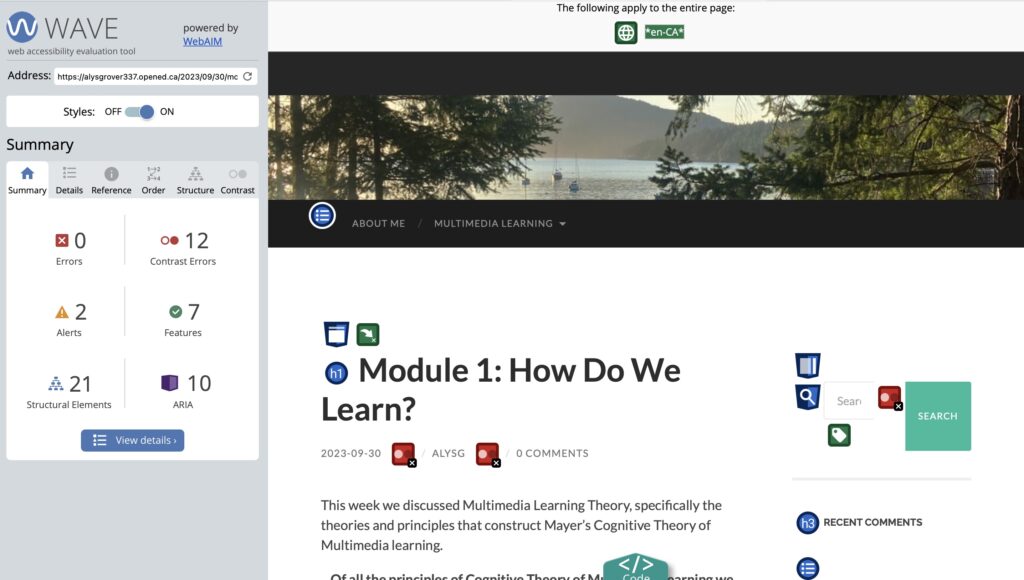
My WAVE accessibility report found no errors, but 12 contrast issues, 2 alerts, 7 features, 21 structural elements, and 10 ARIA. Many of the contrast errors were from the automatic features of the website- things I did not add myself. It is interesting to me that templates are made that have such accessibility issues, it definitely makes me more conscious of the templates I am choosing to use. I wouldn’t have thought to change these features. For features I did add, I find myself using colors such as grey because I think they are “soft” and aesthetically pleasing- this was a great reminder that the look of the website means nothing if people cannot see the components on it. I also did not include any captions for my screencast, something I will definitely include next time I do a screencast or a project with audio. I really enjoy the WAVE platform and will be saving it for future use.
What does inclusive design mean to you?
To me inclusive design means to realize that each individual learns and processes in different ways. It is not fair for us to create a “one size fits all ” design that is supposed to cater to every person’s needs. It means to add features into a design that accommodate more people. For me, it also is important to remember that looks are not everything when it comes to designing pages and sites. I often find myself prioritizing the look of the page over the functionality of it to all people. I catch myself thinking “if it works for me why wouldn’t it work for everyone”, after reflecting on the readings and videos this week about inclusive design I know I need to be much more aware of these small but meaningful details.
Have you used Text to Speech tools before? Did you find it useful? Did you try out some of the different voices? What impact did the different voices have on your ability to absorb information?
I do not have much experience with text to speech tools, I mainly use this feature if I want to read an audiobook while I am driving or doing work around my house. I think that audiobooks use a different more natural tone, because the text to speech tools that I played around with did not sound quite as natural. I tried out Natural Readers and I went through a few different voices. I found that the male voices had a more lifelike tone, but a lot of the female voices sounded quite robotic to me. I personally did not find it useful, but I also know I am not the targeted audience for these features. I think the male voices of Natural Readers would be a great choice for someone who struggles with reading. I hope they are able to make the female voices a bit less robotic as I feel that is an important feature to have. I felt with the deeper voices I was able to take in the information a bit more compared to the female voices, but to be honest I felt a bit distracted with both of them.
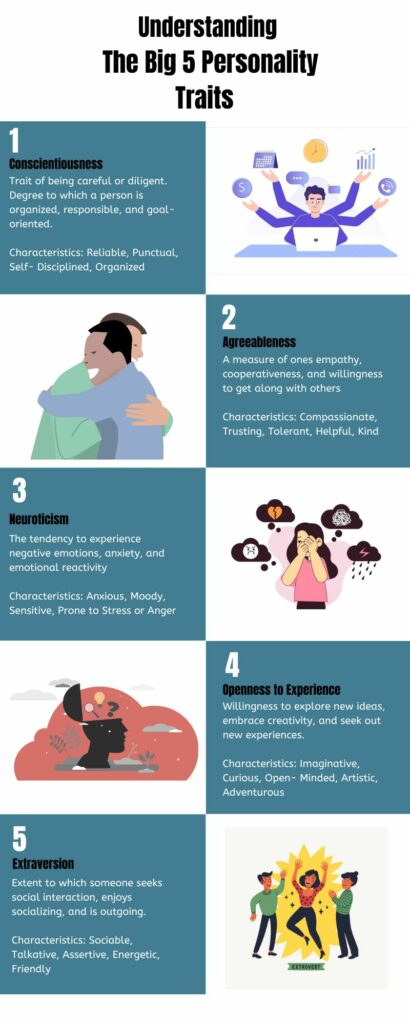
Which design principles did you use to create your infographic in Canva? Which elements of a ‘good infographic’ were you able to incorporate? What other principles did you consider?
I tried to include as many of the design principles that I could in my infographic to make it accessible for the widest range of people. I am new to using Canva so I tried my best to make it neat and focus on alignment, but I found myself struggling to make things perfectly neat. I also tried to work on the contrast of my background colors and text colors. On my WAVE report of my blog post #1 I had a lot of alerts for contrast errors, so I tried to make the background dark and the text colors light. I also used repetition in my design, I tried to keep each of the five categories formatted the same and around the same length. I feel that I could have included more negative space in my infographic, it was quite colorful and did not contain much negative space. I really enjoy using Canva and I want to improve my skills in making infographics as I feel it is a very important skill to have, especially in education.
Overall, I felt this week was very valuable and I enjoyed learning about how to make multimedia more inclusive and accessible.
Leave a Reply
You must be logged in to post a comment.